
Just another WordPress site
Alright, simple and straightforward.
This feed streams all relevant market headlines, but here’s the key…
It’s called SMART headlines, right?!
Right.
So why is it “smart“?
It filters out lots and lots of headline noise that drains your attention.
But most of all…
With one click (clicking the “Ask AI Strategist”) you get a quick explainer of whether the headline is signal or noise.
In other words…
Whether the headline can be traded (and why), or… if it can simply be… ignored!
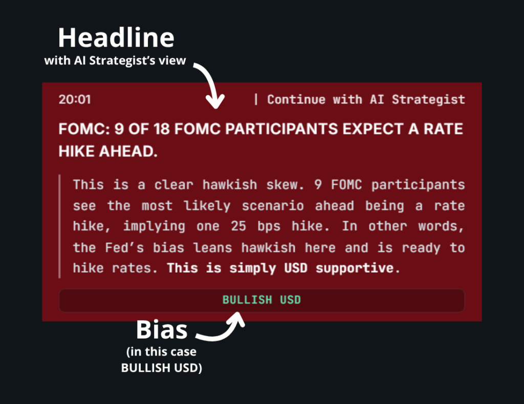
Let’s see an example:
That’s a headline from an FOMC meeting.
And the Strategist is lound and clear (and also right), that macro development is… BULLISH USD.
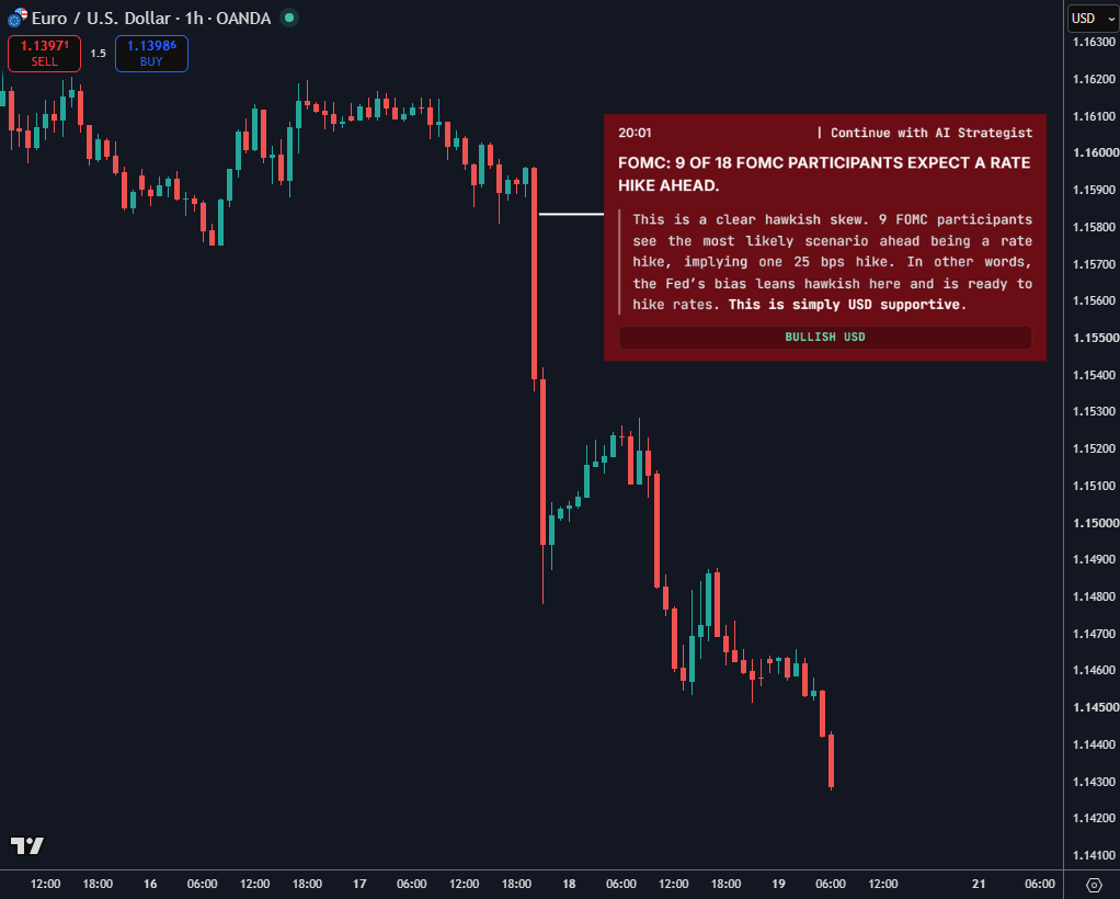
So let’s look at EURUSD after after that:
See what’s going on?
That was a clean macro opportunity signaled by the Strategist that analyzed the headline.
So every headline that hits the market can be passed through the AI Strategist for its quick view on it.
Some headlines will be clean to trade, some won’t.
And the Strategist itself will tell you which ones are.
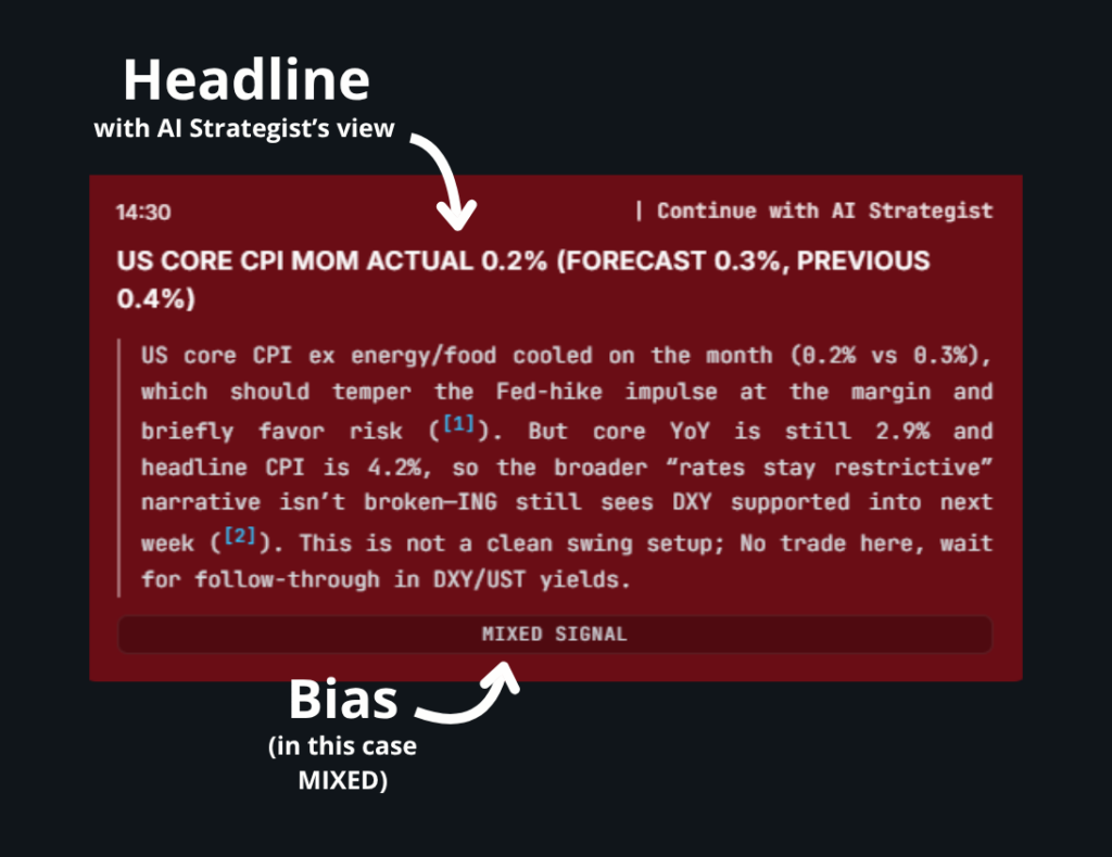
95% of the headlines will be “MIXED”
And that’s a feature, not a bug!
Because the majority of the headlines are in fact… NOISE!
It’s 5% that really moves the needle and that can be traded.
Like the example above.
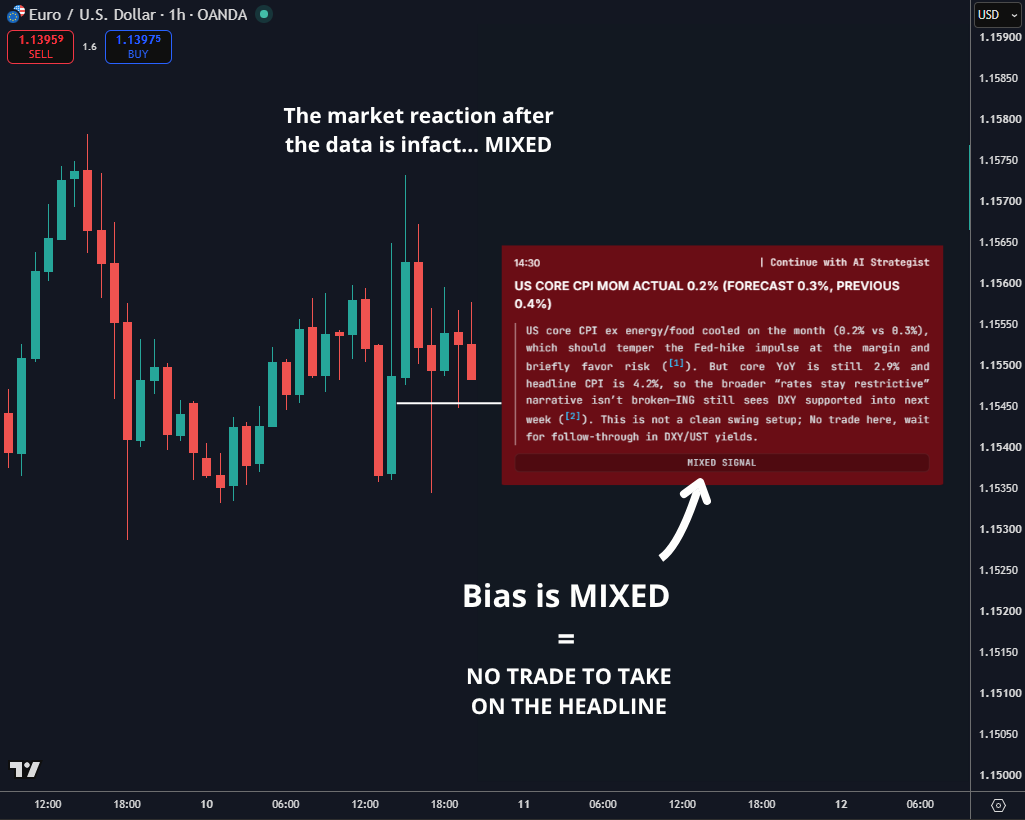
But most of the times you’ll find these:
Nothing!
It just tells you to do… nothing, no trade on that.
And in fact, the market just chopped around on it:
This tool tells you what matters and what doesn’t within the news flow.
Simple and straightforward.
Don’t overcomplicate this one.
If the signal from a headline is “MIXED”, nothing to do with it.
If the signal from a headline is “BULLISH” or “BEARISH”, then there’s a potential opportunity there for a follow through.
Monetary policy is one of the core drivers of market trends.
It’s NOT the only driver, but it’s a big part in our trading strategy.
In particular, monetary policy divergences:
It takes A LOT of time and effort to research what a central bank is signaling to catch these trade opportunities.
Hours of reading transcripts, watching press conferences, researching articles, and headlines.
So for that reason, we’ve created an AI model that does all the research for us.
And it allows us to have a snapshot of each central bank with just a few clicks.
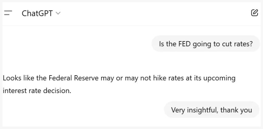
No it’s NOT.
And I’ll show you why.
I’ve OFTEN found that the various AI tools can pick up stale information, irrelevant context.
And after all, they can simply end up giving a completely wrong (or useless) view on the central bank:
Now, as you can image, getting the wrong information is a big deal when it comes to trading.
So the more accurate our information, the better our decision making.
And the better our decision making, the better our trading.
This AI Strategist is trained by us!
It has ALL our knowledge.
Transcripts, daily briefings, macro conversations, trade ideas, you name it!
This is NOT just a simple ChatGPT prompt.
This is a custom trained AI Strategist that knows exactly how to deliver value!
We have added our expertise on top of the AI research capabilities to create the ultimate macro research tool to ALWAYS have the right information at your fingertips in just a few clicks.
This is a tool we personally use in our trading.
And it’s accessible here on the terminal.
Just select a central bank, and it will open up the latest available information.
As you can see, we get the tone, so whether:
1. Hawkish (bullish for the currency)
2. Dovish (bearish for the currency)
3. Neutral (no strong bias)
And we get the relevant information that we need to make our trading decisions.
At the bottom there’s then a useful button to “compare” the research with another central bank:
Or, if we want to dive deeper into the analysis we can open up all the relevant headlines for that central bank, to see what their recent comments were.
Like this:
1. In red it’s the DOVISH comments.
2. In blue is the HAWKISH ones.
That’s how it works, simple and intuitive.
And now here’s where it gets interesting!
Ok, theory is great.
But let’s see this thing fly.
Let’s run a real world scenario.
First, we look at what the European Central Bank is doing:
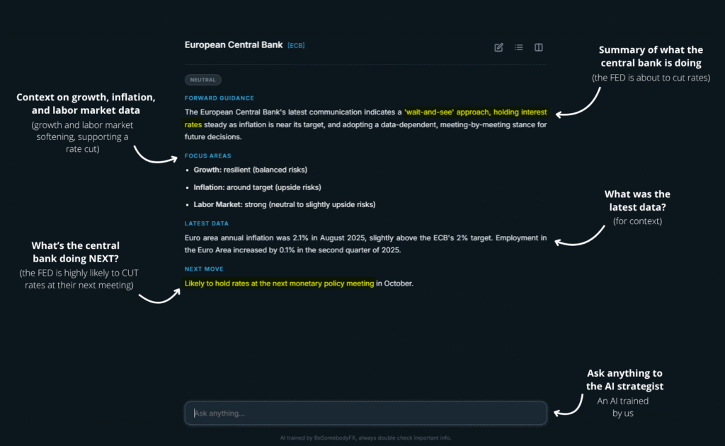
Ok, Slightly hawkish with the ECB looking to keep rates steady.
Now, we do the same for the Federal Reserve:
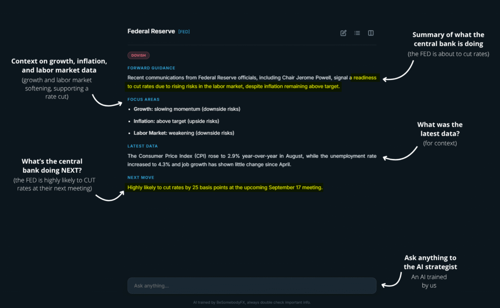
Oh, ok!
That’s dovish.
It’s not a perfect divergence.
But there’s still a noticeable difference in tone there.
1. One is looking to cut rates soon (the Federal Reserve)
2. And the other (the European Central Bank) is not
Perfect!
We have the WHY, we have the fundamental bias.
EURUSD is likely to trend higher.
Do we go and buy EURUSD right away?
No.
We don’t just slam trades because this tool says “hawkish” or “dovish”.
The fundamental context gives us the direction in which the market is most likely going to trend to.
It’s the WHY.
The directional bias.
But then we still need the WHEN.
The… when to act on that trade.
Fundamentals for direction, technicals for entry.
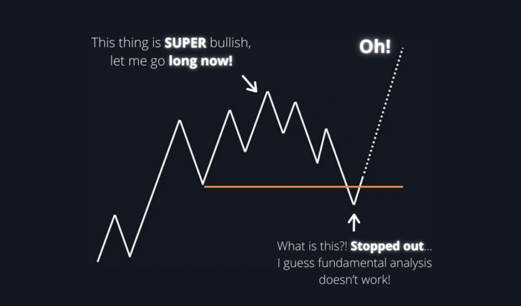
It’s important to match the two, because otherwise:
Makes sense?
Perfect!
So once we have a macro bias, it’s time to time the entry with technical analysis.
We open the EURUSD chart and we see this:
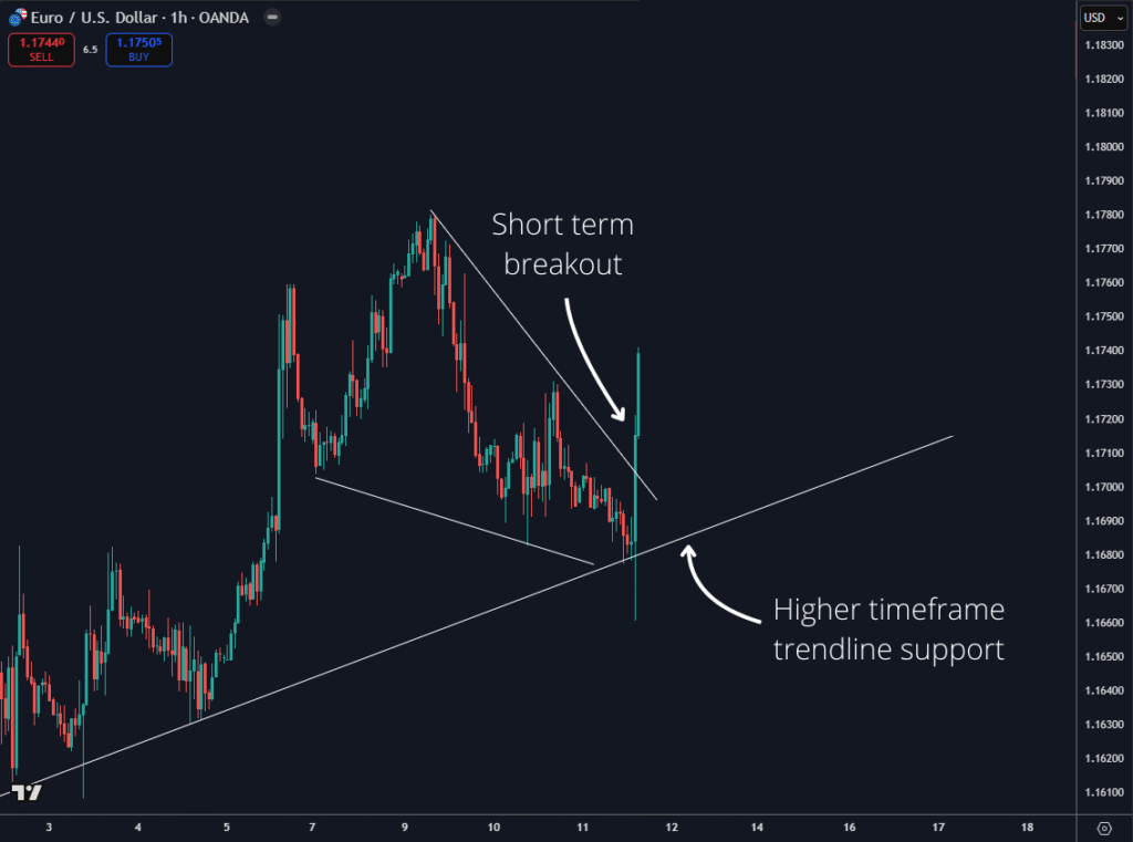
There you go, we have confluence now.
Notice that clean technical structure being breached.
And perfectly from higher timeframe support.
It’s a bullish signal from the chart, and we listen to that.
We went long EURUSD in the Private Network.
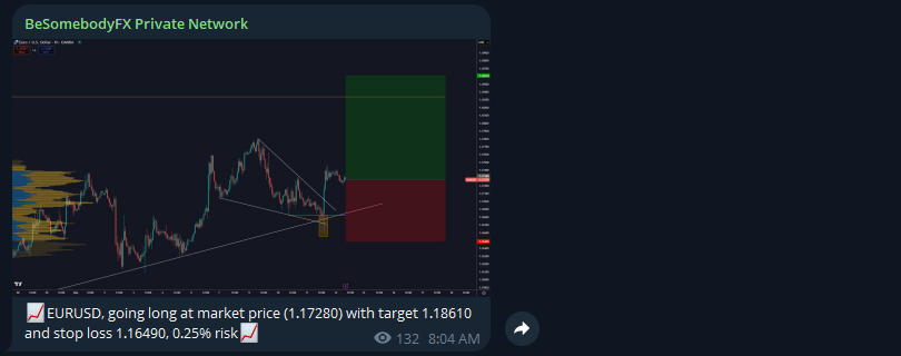
It’s a calculated, evidence based idea.
That leads to a profitable trade:
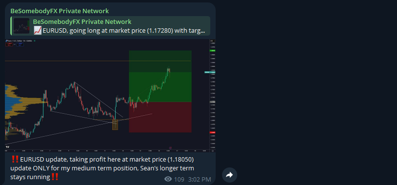
That is how it works.
This tool is powerful.
But like any professional tool, it has rules.
If you don’t follow then, you’ll get chopped out.
Never trade just the monetary policy sentiment.
Always confirm and time the trade with technicals.
Divergence is a process, not a short term event.
Give the story time to unfold, don’t expect the market to move in a straight line, policy divergence trades are medium to long term trades.
So take that into account.
A perfect tool to always be up to date with what central banks are doing, thinking, and projecting.
Then we, as traders, decide how that plugs into the bigger narrative for our trades.
If you just signed up for the Private Network, you may not be able to login here on the terminal yet.
That’s normal!
It can take a couple of hours for your user details to be transferred from the main website (where you signed up) to the terminal (here).
If it’s been a couple of hours already and…
Head to the login page.
And follow the steps to ask for a new password:
You will receive a fresh new link to set your new password.
Once done, you will have full access to the terminal.
Just contact us at [email protected]
And we will take care of it within a couple of hours.
Specific assets in specific periods of the year tend to have flows that repeat year after year.
Not exactly the same way.
Not always.
But often enough to matter.
That’s seasonality.
Think of it as trends that repeat annually in specific periods of the year.
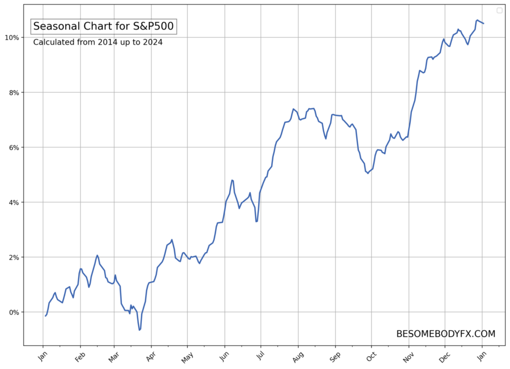
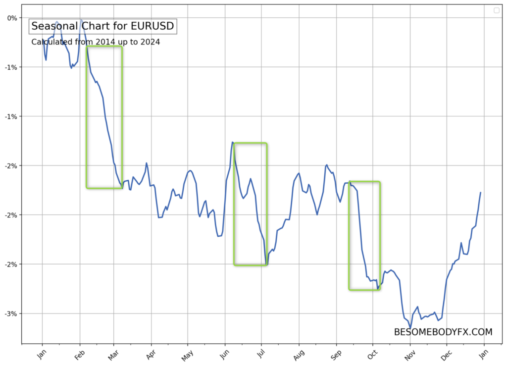
Here’s the S&P500 for example:
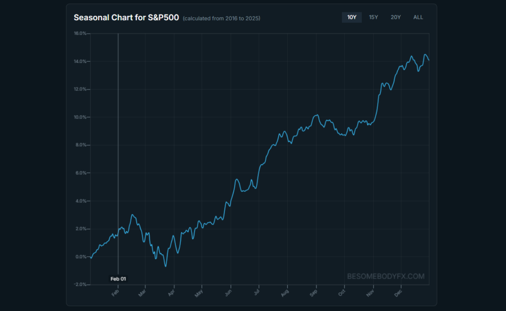
See that chart?
You can interact with it from the seasonality tool.
Click and drag.
Highlight any period.
And instantly, you see the history, the probability, the edge.
This is important.
You don’t have to type dates or think too hard.
Just highlight across the seasonal chart where something looks interesting. The dates update automatically.
This is how patterns are usually spotted, visually first, analytically second.
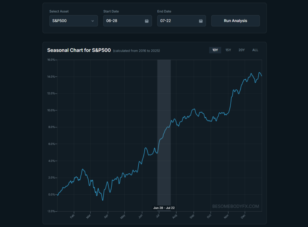
That’s not random.
That’s a seasonal trend.
The S&P500 in that specific period of the year ALWAYS tends to rally.
Literally.
Always.
That’s what the tool allows us to do.
Click and drag your mouse to that specific flow on the chart (tap and hold if on mobile) and the data instantly pops up.
Interesting right?
Well, the market is not made just of speculators.
There are many flows like commercial activity and portfolio rebalancing.
The start of July is a particularly interesting one because it marks the start of Q3, and so the turn from the first half of the year to the second half.
So we can imagine there are some sort of repeated flows that have to happen regularly at that time of the year for reasons related to the turn of the quarter and the start of the second half of the year.
We can’t know for certain!
But that’s what the seasonal charts are there for.
They show us when those seasonal patterns happen.
The point is that we can use these moves to our advantage.
Same happens in currencies, of course.
There are specific seasonal periods where there’s historically more demand for Dollars.
And other periods where there’s less.
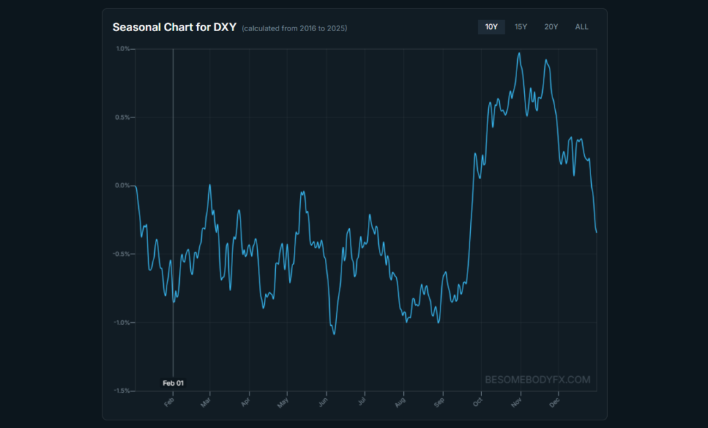
And the same is true for all other currencies, and commodities, and to some extent crypto too.
An asset.
A time window during the year.
How many years of history you want to analyze.
And the tool shows you how that exact setup performed in reality.
That’s the whole process. You can do this for any currency, any commodity, any timeframe. It’s your personal seasonality analyst.
Some traders love analyzing.
Others just want to know:
“What looks interesting right now?”
That’s what the Seasonal Patterns tab does.
It scans the assets, and then outputs the most consistent and strongest seasonal patters, either recently activated, or upcoming.
You can then click a pattern to show a chart of that pattern’s year by year historical performance to see the consistency.
And on top of that you also get a handy button to open that exact pattern in the main section for more details.
This way you always have seasonal patterns on demand.
With this tool first you can avoid getting caught in the wrong direction of one of these seasonal flows, and second ideally position for it.
Simple but REALLY useful.
Alright so let’s see how the Smart Money Index is used…
This system spots anomalies in the daily short sale volume across various S&P500 stocks…
There is a middleman (market maker) for just about every order that is executed on the market. Lucky for us, this middleman always leaves a trail, he is forced to sell short whenever he fills a buy order.
Whenever a market maker fills an investor’s buy order, the MM is facilitating the trade by SHORTING shares. Thus, short volume is actually representative of investor buying volume…
And this is why short volume is a strong indicator of buying activity in our case.
Where we take the daily short sale volume data?
https://www.finra.org/filing-reporting/trf/trf-regulation-sho-2018
With the daily short sale volume data we build this index that we call “smart money index” just because these money have been buying perfectly with very small drawdown every major correction in the S&P500 so they must be smart no? 🤪
We then track the anomalies in this index which is illustrated by a value printed above 0.48x… updated to 0.53x in 2023 to fit new volumes standards.
When that value appears that means there is strong short sale volume which means…?
Which means that the market makers are selling high quantities of market shares to these “smart money”.
As already noted above the concept is extremely simple, when we get a print above 0.53x we buy the S&P500 and hold for 3 months straight…
The examples below are from when the model was set at 0.48x, but again… now it’s 0.53x, either way… when the number turns green, that’s the trigger.
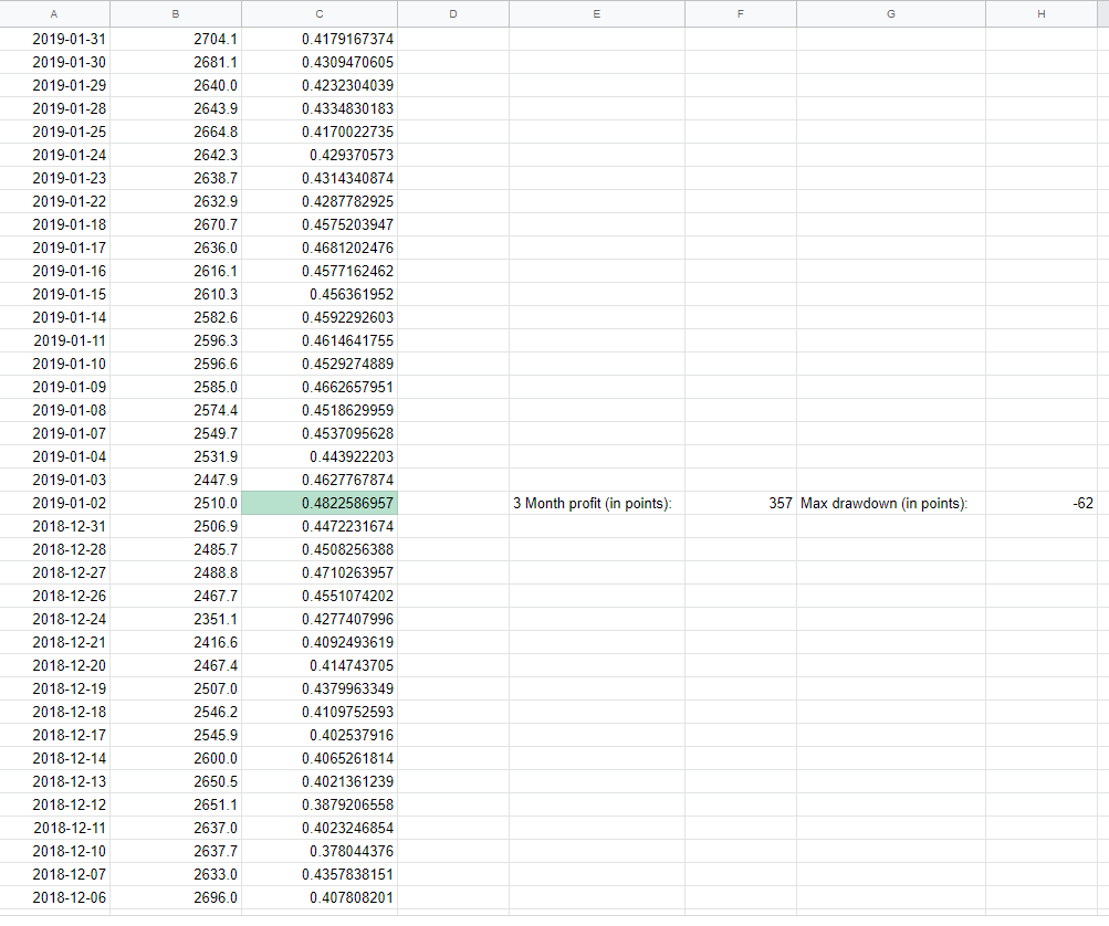
As you can see we colour in green the cells that printed a number above 0.48x so that we can find them easier.
And before you say it… no it doesn’t reprint or overfit, once a day is closed and a value is printed that’s it, no going back…
Trust me it’s very simple, bear with me a second, this is historical data for the sake of the example:
On column A of the sheet you will find the date, on column B you will find the S&P500 daily closure so the price at which the S&P500 closed on that specific date and last but not least the Smart Money Index value in column C.
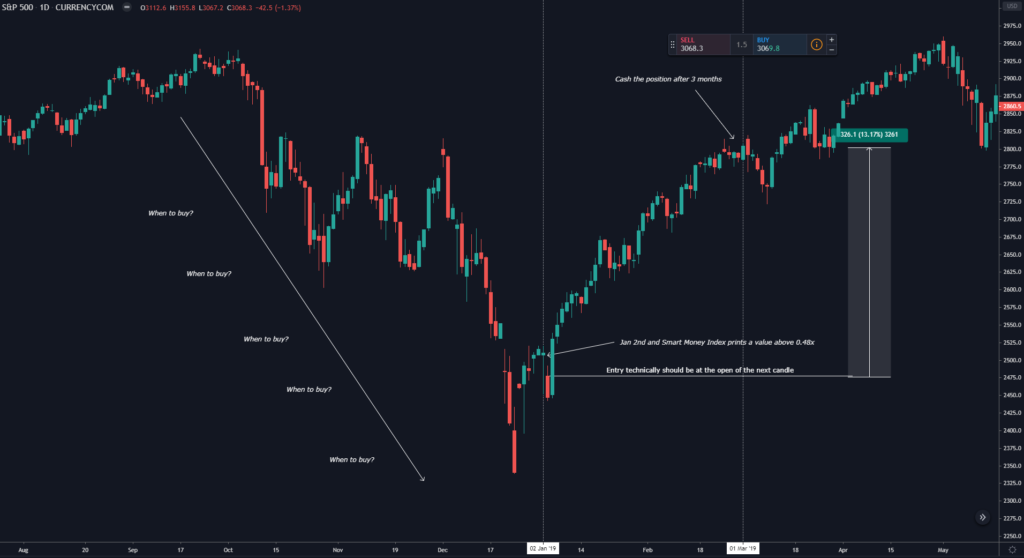
So let’s take a look at what’s happening in the image above, if you take a look at the first value at the bottom it’s December 6th 2018 (2018/12/6) and the S&P500 is trading at 2696, going ahead a few days and we see that the S&P500 is trading lower and lower everyday so it’s more or less in a bearish trend so when it’s time to finally buy the dip safely?
Well that’s the Smart Money Index job… The volume anomaly appears when the index is above 0.48x, so as soon as we get that print we open a buy position and hold for 3 months straight…
So technically here we could be holding forever, no joke!
Here we could be just buy the dip when the index says to and hold until we are satisfied with the profits or just trail stop loss higher and higher (when the S&P500 starts to trend after a crash you don’t stop it easily), then usually more signals are generated while the market goes up, hence more positions are opened and profits compounded…
BUT for the sake of the strategy we picked a timeframe to hold the position and then sellback so we picked 3 months because that’s the average duration of a prop trader portfolio.
Back to the example, the S&P500 is “crashing” (as the perma bears would say) until we finally get a print in the index above 0.48x in January 2nd 2019, so we open our buy and hold for three month straight and well yes that was basically the bottom, we encountered a small drawdown of 62 points but closed the trade in 357 points of profit.
Here is the visual representation:
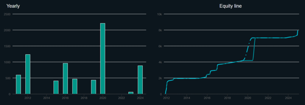
Yes there hasn’t been any trade in 2013, in 2014 and in 2018, 2021, and 2022, why?
Because we didn’t have enough of a correction to trigger a buy signal so no position was opened.
For some this may be a bummer but hey this is an extra tool that you add on your portfolio of trades so it’s extra performance added to what you already perform with regular trading.
This system didn’t generate trades in those years but we have other ways of profiting from the market too, plus don’t forget it’s an extremely “stress free” and effective system, just open the position and cash it after 3 months, don’t forget the value of the profits are relative to the amount of work you put into a position…
It’s more valuable a 40% a year made with just a few hours of work every month/week or a 100% a year made with 8 hours of work everyday?
I will take both because I’m a market junkie  but yeah you get the point…
Win rate? 36 winning trades and only 1 losing… (a mere -15 points)
Risk reward?
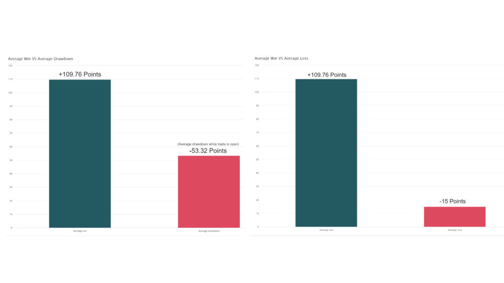
Average win is 6 times more than the average loss (which is only one) and for us it’s very important the drawdown during a trade which on average is around -50 points which is half than the average win, those are some great stats…
As much as i would love to say YES, we can’t ever say that for certain as past performance is NEVER indicative of future results.
But hey!
We have something that has proven to work over the past 15 years with great risk reward and stats which give us a high chance of more profitable years ahead, and most of all it’s extremely effective to use and “stress free”. Wait for the signal, deploy your position and wait 3 months to cash your profits, what else you want? I would pay gold for such a system…
Ah don’t worry you don’t need to opt in the terminal everyday to check where the index is at, we will of course notify you on Telegram every time we get a print above 0.53x 
Enjoy
This is a fairly straightforward tool.
You have access to up to date seasonal charts for any asset you want.
Indices?
Yes.
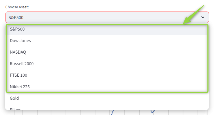
Currencies? All of them yes, majors, minors, and exotics.
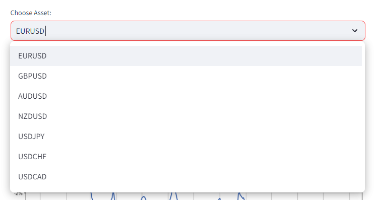
Commodities?
Absolutely.
Now the question becomes…
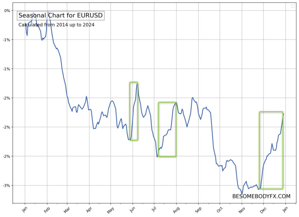
There are many instances here of seasonal patterns but let’s take a random one.
Look at the chart from late June to late July…
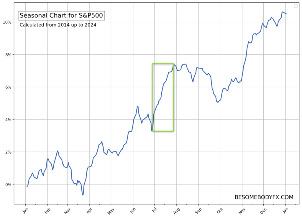
Notice the impulsive rally on the seasonal chart during this period?
That’s not random.
That’s a seasonal trend.
The S&P500 in specific period of the year ALWAYS tends to rally.
Literally.
Always.
Here’s exactly the S&P500 year by year between June 27 and July 24:
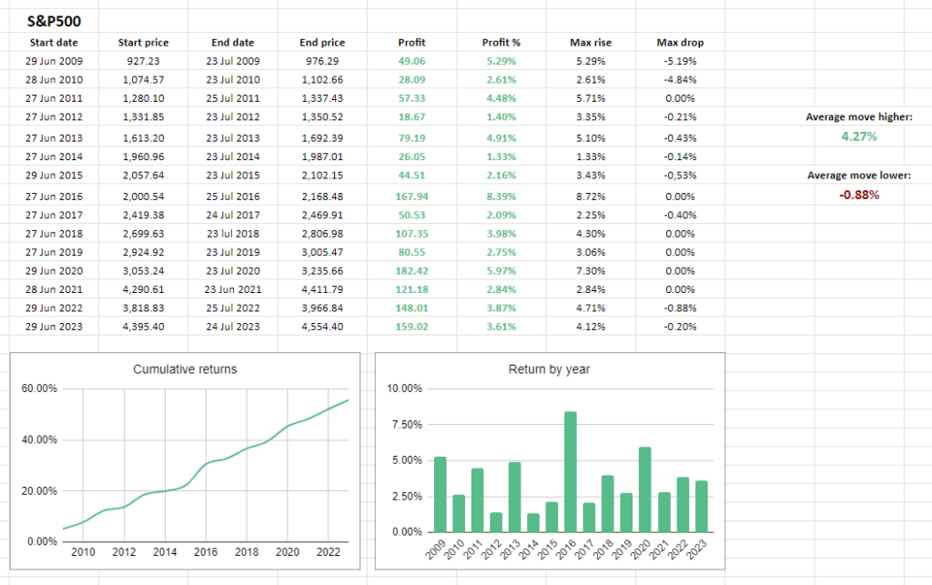
Interesting right?
But why that happens?
Well, the market is not made just of speculators.
There are many flows like commercial activity and portfolio rebalancing.
The start of July is a particularly interesting one because it marks the start of Q3, and so the turn from the first half of the year to the second half.
So we can imagine there are some sort of repeated flows that have to happen regularly at that time of the year for reasons related to the turn of the quarter and the start of the second half of the year.
We can’t know for certain.
But that’s what the seasonal charts are there for.
They show us when those seasonal patterns happen.
The point is that we can use these moves to our advantage.
Same happens in currencies, of course.
There are specific seasonal periods where there’s historically more demand for Dollars.
And other periods where there’s less.
And the same is true for all other currencies, and commodities, and to some extent crypto too.
Seasonal charts allow us to spot these patterns to first avoid getting caught in the wrong direction of one of these seasonal flows, and second ideally position for it.
Simple but REALLY useful.
If you try to follow everything manually, you can easily end up with more information but less clarity.
That is exactly why the institutional score exists here.
It is built to answer one simple question:
Which currencies have the strongest fundamental story right now, and which ones look the weakest?
That is it.
The ideal is simple.
The best trades usually come from pairing strength against weakness.
Not strength against strength.
Not weakness against weakness.
Not two currencies with almost the same story.
You want contrast.
If one currency is supported by a stronger central bank story, better data, better yield support, and a cleaner market backdrop, while another currency is being pressured by the opposite, that is where things get interesting.
The institutional score helps you find those contrasts quickly.
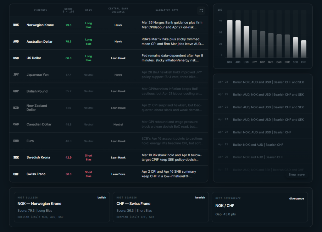
At the top there’s the BULLISH BIASED currencies.
At the bottom there’s the BEARISH BIASED ones.
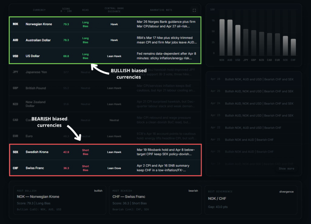
Fairly straightforward, right?
The strongest currencies are the ones with the best overall fundamental support right now.
The weakest currencies are the ones with the weakest overall fundamental context right now.
And that’s all to be honest.
That’s all you need.
Think of it as a macro filter.
Instead of looking around analyzing 30 different FX pairs randomly, you begin with the currencies that actually have the strongest fundamental backing.
That alone can saves hours of research.
1. Which currencies are currently strongest
2. Which currencies are currently weakest
3. Where the best long vs short opportunities are
4. What the key market context is
5. Where the cleanest fundamental divergences are.
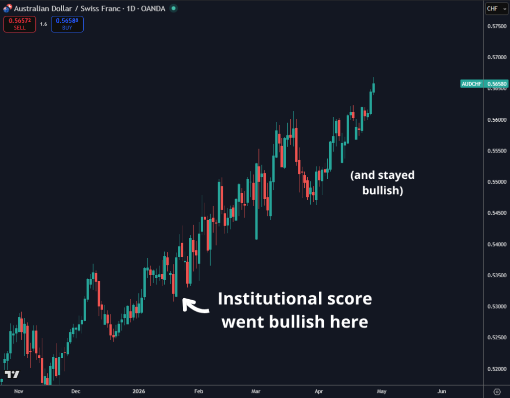
The score has been showing the AUD among the most fundamentally supported currencies, while CHF among the weakest.
You do not need to immediately know every single detail behind that ranking.
You can, if you want, dive deeper into the logic by analyzing the details:
Or simply ask the AI Strategist.
Just click on the “Ask AI Strategist” button on top.
The market context is currently more supportive for the AUD than it is for the CHF.
So your attention should naturally move toward AUDCHF upside.
That does not mean you can buy AUDCHF at any price.
No.
But it means you now have a bias.
Instead of looking at 30 random FX pairs, you are looking at the exact one where the fundamental contrast is strongest.
That is the power of the institutionals core.
It reduces the noise.
It gives you focus.
It helps you know where the story (hence the trend) is cleanest.
And he’s how AUDCHF has been performing since the score started showing the AUD in the “long bias” and the CHF in the “short bias”
Oh and by the way.
You can see a history log of all the bullish vs bearish currencies at every update:
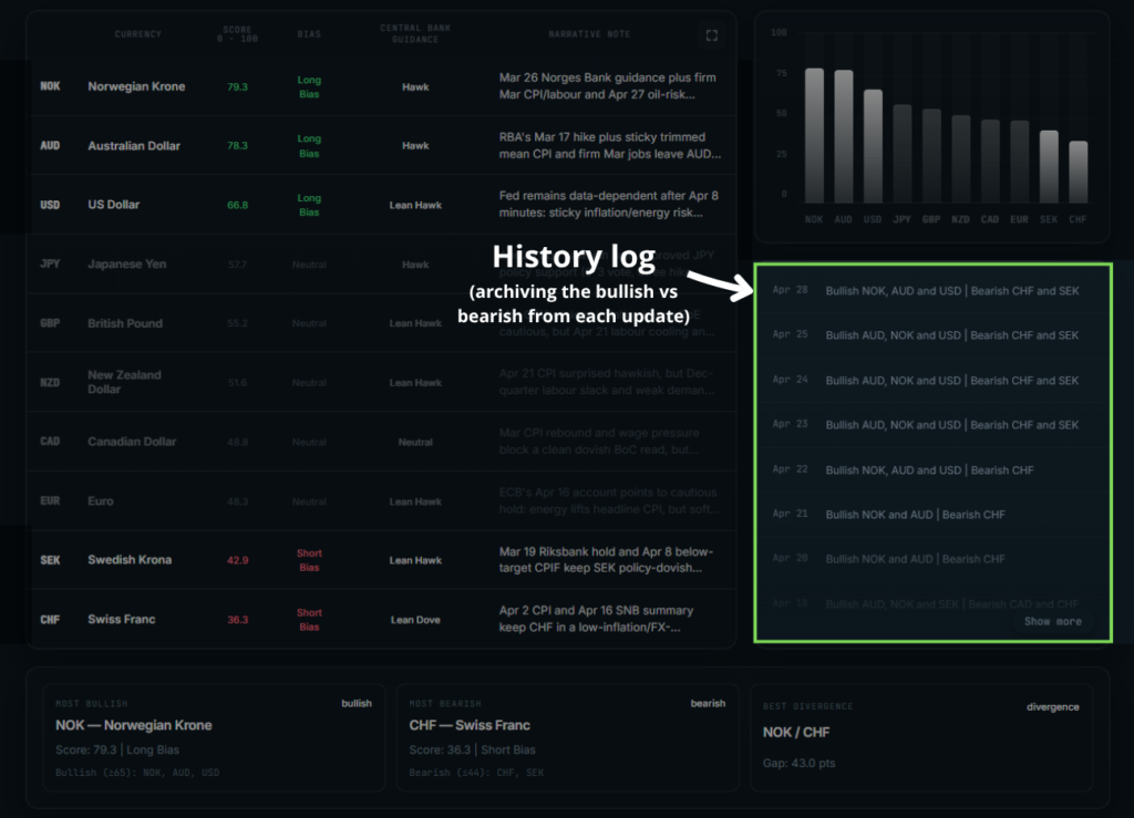
This way you can backtest this with your strategy or just see historically what the context was at any given moment in time.
This is what this tool does.
It does all the heavy lifting behind the scenes.
It analyzes:
1. Inflation, labor market, growth
2. Interest rate expectations
3. Forward guidance
4. Risk sentiment
5. Positioning
And it compiles everything into a straightforward score that tells us which currency is better positioned vs which one is more vulnerable in the current context.
Because once you know where the strongest story is and where the weakest story is, you stop wasting energy on every random move in the market.
You stop treating every chart like it deserves your attention.
You stop forcing trades in pairs where the fundamental edge is not really there.
And you become more selective.
Because you know exactly where to focus on, and in which direction.
The concept here is very simple.
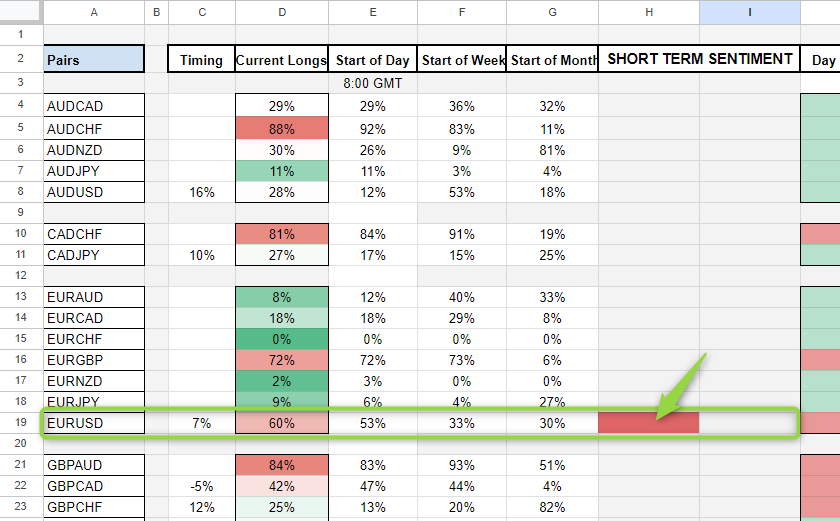
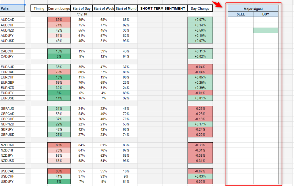
The short term sentiment signal is, as the name says, a short term sentiment momentum signal.
So it tells us to sell when retails are buying in bunch and buy when retails are selling in bunch.
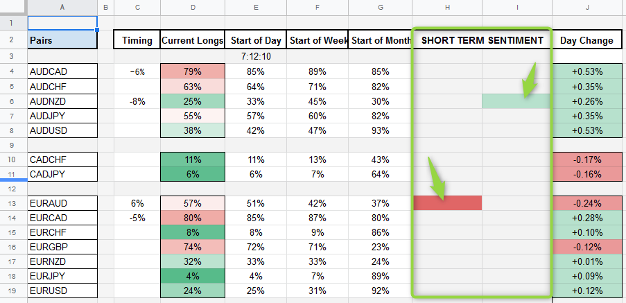
Those have some very specific parameters that when triggered it signals that retail traders are piling into shorts or longs.
And yes, the signal is already set up to indicate the opposite of what retails are doing.
So if it’s red it means retails are buying and instead you want to short.
If it’s green it means retails are selling and you want to long.
But let me get into more details…
The first way you can trade it is by opening a position accordingly to the short term momentum and catch some pips using some simple technical analysis.
Basically the short term momentum works as a contrarian to what retails are doing.
And with retails we mean the “dumb” money of the market, so once a signal is fired that means that retail traders are committing to a specific side in bunches, as a result, you ONLY want to trade against them as the markets will likely push against them.
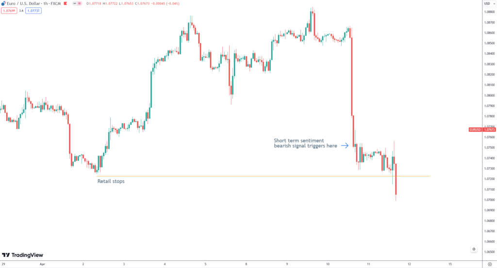
So if the short term sentiment is giving a bearish signal on EURAUD for instance, like in the example above…
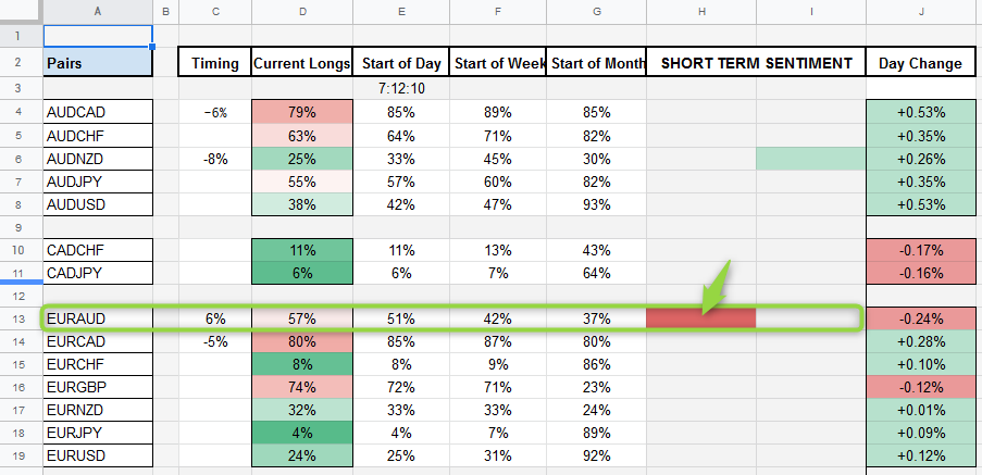
At that point you want to look at the “timing” section.
Why?
Because the timing is key.
The perfect timing is 5/-5 and 6/-6, and the closer the timing is to those values the better it is.
Let’s say, for the sake of argument, you missed the perfect timing because you were away from your desk, at sleep or at work etc…
You log in the terminal and you see a bullish momentum in EURUSD with timing at 15. Well, that’s way off from 5 and means the move more or less has already happened and most of the retails are already trapped.
And…
You DON’T want to just chase the price selling or buying at any given price.
And certainly you don’t want to get into a short term signal too late, when most of the move has already happened.
No.
So the “timing” section matters.
And in this specific example you can see EURAUD on the short signal has a timing of 6%.
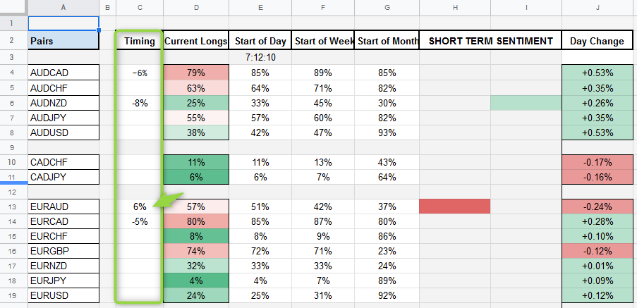
That’s close enough to 5%, which means the signal is still… fresh.
Ok, now what?
Now it’s up to you to open the trade with some basic technicals.
The sentiment spreadsheet tells you where retails are getting trapped and where you should focus and in what direction you should look for a trade.
But the rest is done with the chart…
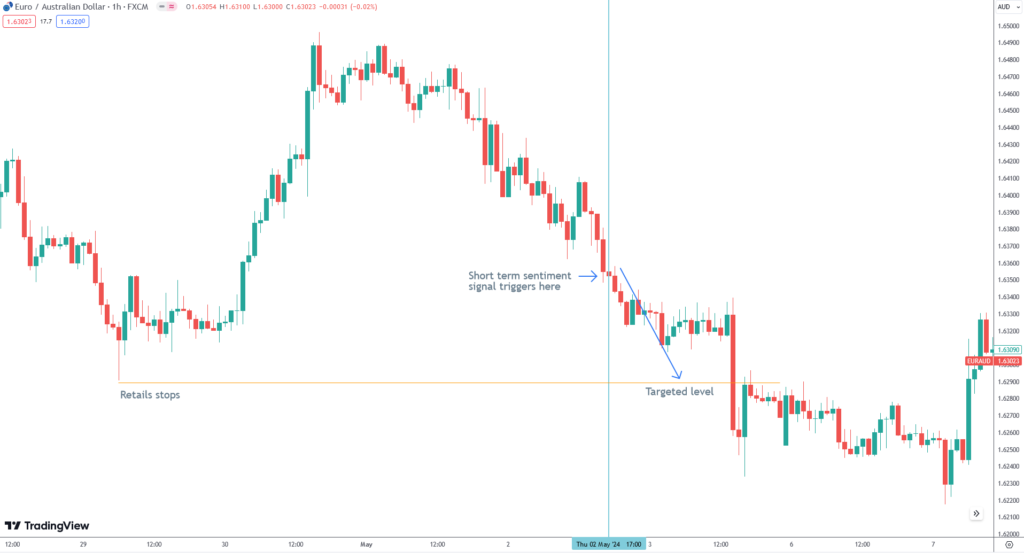
See what’s the target there?
It’s retail stops, yes.
That’s the whole point of this tool.
To see where retails are being trapped, and to then expect the market to move towards a zone of liqudity, where most retails stops are placed.
For instance…
If price is approaching a technical support…
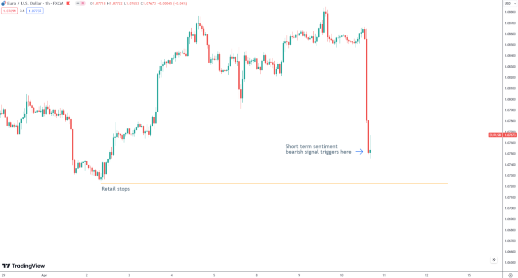
And the sentiment is showing this…
Do you think that support level where A LOT of retails have their stops right below there is going to hold?
Unlikely…
Makes sense?
Perfect.
As you can see, it’s VERY short term type of stuff.
Once a short term momentum signal is triggered you should just want to target the very next liquidity level.
That can be just 10 to 15 pips away.
So again…
Just short term type of stuff.
After the liqudity level has been swept then the trade is done.
Alright, with the short term section cleared, let’s talk about the medium term ones…
First, what are the medium term signals?
They trigger once many multiple conditions are met.
So there aren’t many of these every week.
And they operate similarly to the short term signals, but on a more larger time horizon.
So instead of 10 to 15 pips moves these can target larger liquidity levels that can be 50 to 70 pips far.
The key here is to match this up with some of your technicals.
Don’t just follow blindly the suggestions but use your skills to catch good entries with good risk rewards.
And also, keep in mind…
There can be some false signals here so make sure you keep an eye on it once it triggers, the spreadsheet is resetted every new day so the next day the signal will disappear but it remains valid until retails current longs remain below 55 for BUY signals and above 45 for SELL signals.
The bubble chart is an MUST HAVE tool for intraday traders.
The use is very simple…
It works in 2 zones, the bottom left rectangle is the buying zone, the top right rectangle is the selling zone.
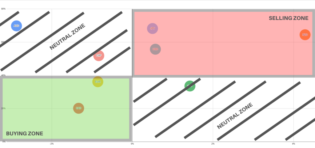
So if a currency is in the buying zone then it’s a good buy, and any currency in that zone is a good sell.
But what does it actually show?
The chart is giving you a visual representation of fresh retail action.
The further a currency is on the bottom left the more retails are selling.
And giving that we take a contrarian approach to the “dumb” money you only want to BUY that currency, at the same time the further a currency is at the top right of the chart the more retails are buying it and so we only want to SELL it.
The rest is just mixed so don’t bother with currencies in the top left zone and bottom right zone.
But so what this chart does for me?
It gives you the BEST pairs to trade every single day! So you can have that edge to make some profitable scalps.
Basically the bubble chart is resetted every day before the European open, so every day you get fresh new sentiment from the chart.
So you will see how every morning before the European open the chart will reset itself to the middle line, and the currency will then start slowly moving in the buying or selling zone as the live retail positions get opened in the market.
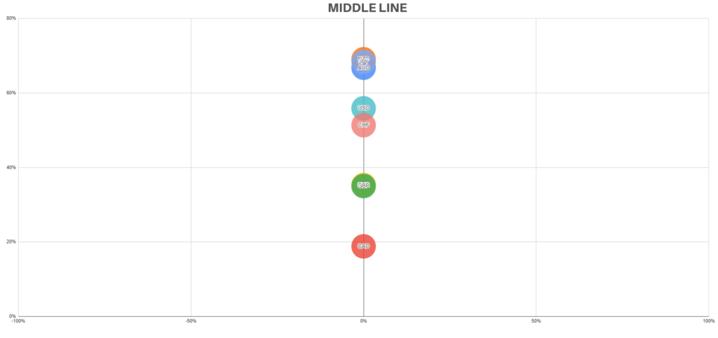
This is a great tool to help you get fresh market sentiment visually and to get the best pair to trade and the direction to take every single day, the furthest currency in the bottom left is the best buy and the furthest currency in the top right is the best sell.
For instance, you log into the terminal and you see…
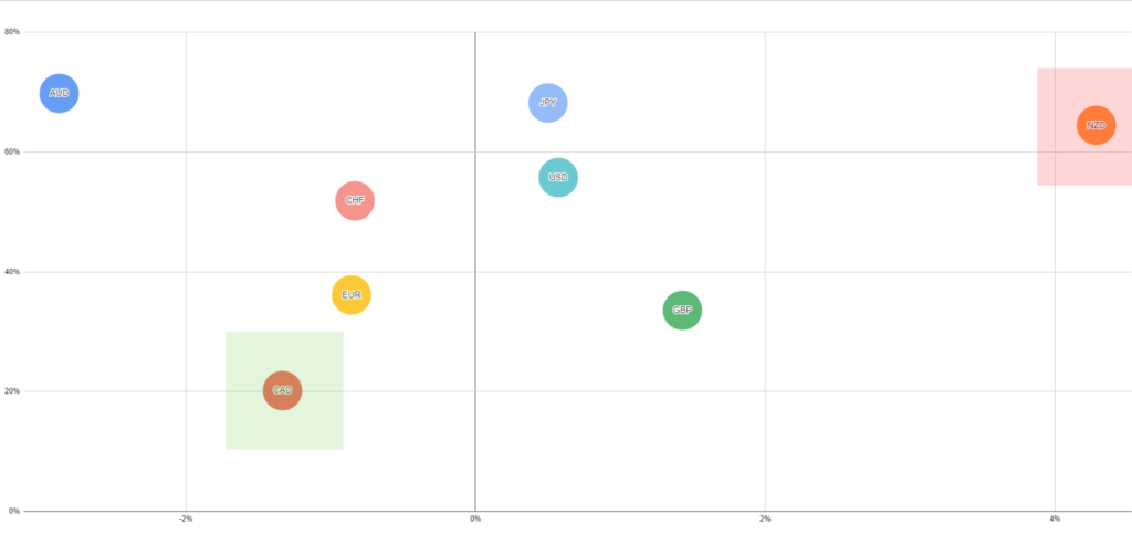
The CAD is the best BUY at the moment while NZD is the best SELL, making NZDCAD the best SELL of the market, that’s the pair you should focus on for the day, don’t get distracted by to many things, focus on 1 or 2 pairs for your intraday, that’s it.
And remember…
Always use some technicals to time the entries, this tool is just an extra confirmation to your trades.
We need to get further in-depth with the intraday trading so that you can have the most edges possible for your trades, here comes the average daily range and the Daily confirmation as further confirmation.
First of all, for further confirmation you should want the Daily Confirmation to be in line with the signal and your direction…
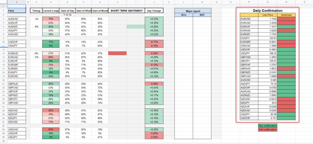
Green is giving you the confirmation to buy when there is a bullish signal, and red gives you the confirmation to sell when there is a bearish one.
So if you get a signal to BUY you want the “sentiment semafor” to be GREEN if it’s RED you should skip the trade, and viceversa for a SELL signal you want the “sentiment semafor” to be RED.
Ok?
Alright.
The last confirmation is the average daily range.
This is useful for you to set take profits and stop losses, but it’s also very useful to see if there is more juice in the pair to move or not.
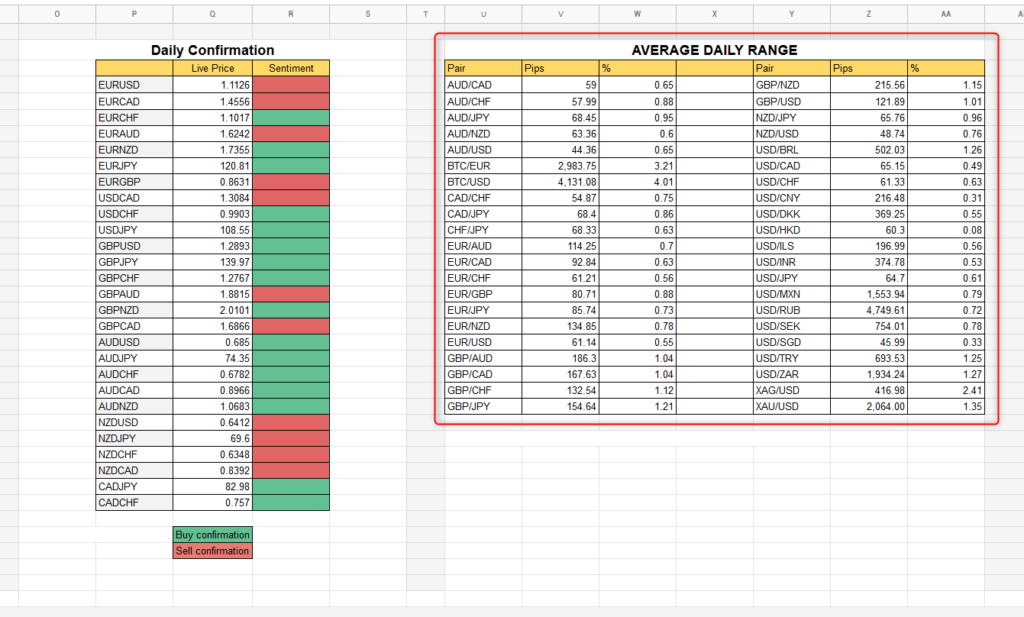
So let’s say we get a short term signal to sell EURUSD and it has a daily average of 60 pips, and price has already moved 80 pips since the beginning of the day.
That suggests you to be a little bit more careful with the trade because the pair is already beyond its daily average move.
So in that case you should want to size lower, or even avoid the trade if it doesn’t line up well enough on the chart.
Below the bubble chart you will see some data that is more for medium-long term traders.
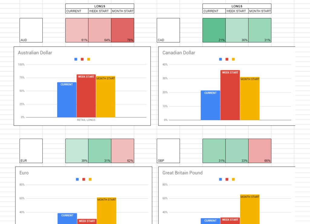
That data is showing behavior of retail traders during the week and the month on specific assets, what needs to be looked at here is the commitment in certain directions.
What do I mean?
I mean that we want the data to show a clean trendline showing us how retails are gradually committing into a specific direction, so that we can trade against them.
This tool is more of a “overall” outlook of what the retail traders are doing in the market, it’s interesting to use it to find currencies where they are committed to one specific side…
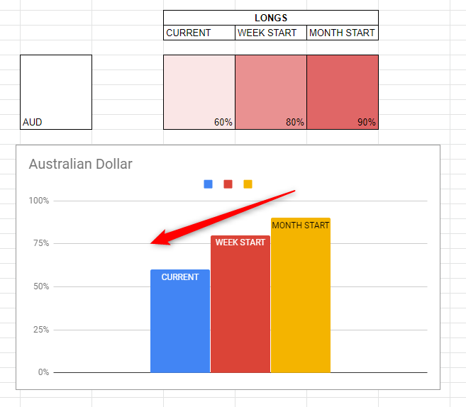
So for instance in the example above if retails started the month at 90% longs in AUD and the week after they are at 80% and after a few days since the beginning of they week they are at 60%, that shows us that they are closing their longs and adding to shorts.
So what we want to do? trade against them 😉
If they add to short we add to longs and viceversa.
Your might be confused now.
But this is why we are here, by being part of the private network we will suggest you the BEST trading opportunities every time we see one.
Plus, all of these retail data will start to make sense after months of using it.
Don’t expect to start learning the retail behaviors in a few days, you will need to watch the data and the charts for a long time before you will metabolize how everything works, how retails get trapped, how and where they add positions, where they get stop hunted and more…
But with that in mind…
From now on you have no excuses, you clearly know where the retails are stuck, if you fall into the market traps again then it’s better if you close your broker account.
This tool will not only be useful for your personal trading but if you follow a signal provider for instance you can filter some of his “bad” signals by seeing if the “dumb” money are buying or selling.
And just as a side note, the average retail trader is wrong 80% of the time, this means that every now and then they will be right, so don’t expect the markets to always go against them, 20% of the time they will be right, use the other 80% at your advantage.
Please note the spreadsheet is fully automatic and does not require any input from yourself, but it’s wise to refresh the page here and there to make sure you are up to date.